-2833Days
-18Hours
-37Mins
-52Secs
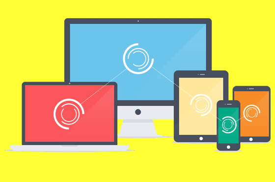
Why should you make you WordPress website mobile friendly, you’re asking? It’s because, obviously, nowadays, more and more people are using their smart phones for their business. Due to the advances in mobile phones and the convenience they offer, they can totally replace PCs and laptops when doing simple business works. For example, if you are at a airport and it’s inconvenient to take out your laptop, but you have some unchecked mails and some websites to visit, what will you do? Chances are that you will do them with your mobile phone. Now, let’s envision in another way, say, you’re no longer the businessman but the owner of one of the websites the businessman will take a look before deciding on signing a big contract. However, while all the others are mobile friendly, yours is not. Big problem! At least it will leave an unfavourable impression on the businessman! That’s why I’m here writing you this “WordPress Guide: Essential Tips to Make Your WordPress Website Mobile Friendly”.
A mobile unfriendly website may drive the visitors away. Want to stop that from happening? Carrying out the tips below, and your website’s visitors will no longer have to pinch and zoom with difficulty. Successfully applied to a whole load of website, these methods will guarantee a stunning appearance of your website on mobile phone screen!
- Use a Mobile Friendly Theme
- Set Image Width to be 100%
- Make Use of Media Queries
- Be Cautious when Using Extra Spaces
- Do not Use Flash
- Avoid Using Free Themes
- Use Standard Fonts
- Simplify Design
Now, let’s see how each works, shall we?
1. Use a Mobile Friendly Theme
The WordPress community knows for a fact how essential a mobile friendly website is, therefore, most WordPress designers have been focusing on designing mobile compatible website themes. Gone was the time we simply chose the best themes we thought for our websites to appear as smooth as possible on PC and laptop screens. In recent years, based on the real situation that a large number of people prefer surfing the Internet through their mobile phones, you we should and must go for the theme that is mobile friendly and ensure our website the best appearance on cellphones.
The best option is to select a theme with this feature, which will help you not spend money on hiring an expert to transform your website to a mobile friendly one. However, if you cannot find something both suitable for your website and mobile friendly at the same time, you can always hire an expert to assist you in developing a mobile compatible website. The bad thing here is that it will cost you a sum money, certainly.
2. Set Image Width to be 100%
Another thing worth memorizing is to give your images a maximum width of 100%. When you do this, your images will be automatically resized if they become too big for the mobile device to handle.
Add this to your website’s CSS stylesheet:
img {
  max-width: 100%
}
In case your images are set as background images and not as img tags, simply set the background-size CSS property to contain. This will allow the background image to resize when the screen is too small.
.header {
  background: url(header.png) 50% no-repeat;
  background-size: contain
}
Don’t worry about the image becoming blur or looking unclear when made smaller? This won’t happen on a modern mobile device. To be specific, when a user zooms in on a picture, the browser will return the clarity as he zooms in. What is more, make sure your website doesn’t have the user-scalable=no property set in a meta tag. If it does, the user won’t be able to zoom in and out.
<!-- DON'T DO THIS! -->
<meta name=viewport content='user-scalable=no'>
3. Make Use of Media Queries
Although many people have neglected the advantages offered by media query, the truth is that this media query will help your website be displayed easily on any device.
The procedure is like the following: It will ask the device its size and then make the browser display the website accordingly. In reality, it is a part of mobile friendly sites which enable your website to configure as per the device used by the user. If you ask whether there is any other advantage, I’m here to answer: yes there is. Not only can this make your website appear easily on any device, it will also make it look good on any device, not just the well-known ones.
4. Be Cautious when Using Extra Spaces
You may already know the technique of showing long strings of numbers to users. It is to break them up into 5 letter groups with a blank space inbetween (e.g., 43514 3a1b5), so as to help users remember five digits each. However, the smart ones simply copy and paste the whole strings of numbers and then delete the blank spaces. Though deleting the blank spaces on a computer or laptop is not much of a big deal, the situation is completely different on a mobile device. How to fix this? Well, instead of showing blank spaces in between the five-letter groups, how about simply wrapping the five letter groups in an element with some padding in between?
5. Do not Use Flash

As a matter of fact, Flash cannot be used on mobile phones because they do not support it. However, many people generally assume that visitors come to their website via laptops or PCs, so they keep using Flash. Therefore, those who use Flash for their website design, without preparing for another proper mobile website, often find themselves in a difficult position when they try to draw the attention of mobile users.
Don’t mourn over this, though. We all know that Flash technology is getting outdated. Compared to Flash, HTML now is a much better choice and widely used by most designers.
6. Avoid Using Free Themes
There are always two kinds of themes for you to choose, free or paid (premium ones). The main difference between these two is that free themes are not always responsive designs, while almost all of premium themes are. Why is that? Because responsive themes need coding, and when you pay for it, you pay for the access to that coding. I bet you know the advantages of using a responsive theme already, so I won’t be listing out its benefits here. Think for yourself, how different it would be if your website cannot adjust itself to fit the mobile screen? No mobile users would favor that, honestly, and you will find yourself losing all of them in such a short time.
Therefore, if you want to have an amazing website which performs excellently not only on laptop and PC screens but also on those of mobile phones, my advice here is do not opt for free themes.
7. Use Standard Fonts
While using custom fonts makes your website appear more professional, but it also takes longer for mobiles to load your website. Why? Because custom fonts require visitors to download large font files before the page can be viewed. On mobile phones, the downloading time is longer, hence, your website will be a plain white space on the mobile screen before it finishes the downloading.
If you load your fonts with Google Font Loader, you can always display the text in a default font at the beginning, and then re-render the page in the new font after the downloading finishes. To implement this, you will have to write two sets of CSS rules where you reference the custom font, in which one uses the default font, and the other will become active when the font has downloaded. By this way, the user can read the text while waiting for the download to end and they can also see how good-looking your custom font is after that.
<script src='//ajax.googleapis.com/ajax/libs/webfont/1.4.7/webfont.js'></script>
<script>
WebFont.load({
  google: {
    families: ['Open Sans']
  }
});
</script>
<style type='text/css'>
.header {
  font-family: Arial
}
.wf-opensans-n4-active .header {
  font-family: 'Open Sans'
}
</style>
Give attention to the .wf-opensans-n4-active class selector that is added to the website by the Font Loader after the font has finished loading.
8. Simplify Design

We are all tempted to make our website look outstanding from the crowd with texts, colors, photographs and other beautiful elements. However, the sad truth here is that it only looks that amazing on desktop. For mobile screens, it will cluster together in an unpleasant way to look at, and also will prolong the downloading time. Therefore, it is advisable that you have a simple website design for mobile users.
Wrapping Up
It is not always easy to balance between a good looking website on desktop and a wonderful same one on mobile phones. Sometimes, you will have to sacrifice the good for the best. With a little luck and more than a little of hard work, you can, anyway, get the best of the both worlds by following the tips I have just presented to you in “WordPress Guide: Essential Tips to Make Your WordPress Website Mobile Friendly”.
Category: Tips and Tricks
Tags: how to make website mobile friendly mobile friendly wordpress wordpress guide wordpress website
- Divider With No Text